
You've got a beautiful website, great products, and buyers who want what you have. They get to the cart and hit the checkout button, only to be met with a complicated process with too many hoops to jump through.
Many may become impatient and leave.
Fortunately, you can make sure your customers don’t leave your site empty-handed and frustrated. By streamlining your checkout process, you can help prevent cart abandonment and increase your conversions.
In this post, we’ll look at some common checkout problems that often lead to cart abandonment. Then we’ll share five tips to help you improve your store’s checkout process. Let’s get started!
Common Checkout Issues That Can Lead to Cart Abandonment

According to recent studies, over 69% of online shoppers abandon their shopping carts. Some of the main reasons for this include:
- A lengthy or confusing checkout experience
- Forcing visitors to sign up for accounts before they can check out
- Jarring design that’s inconsistent with the brand
- Sketchy-looking payment pages that don’t offer a sense of security
If buyers can’t get what they came for quickly, they’re likely to leave your site and do their shopping elsewhere.
Therefore, it's vital to ensure that your checkout process is quick and easy, and that it blends in nicely with the rest of the shopping journey.
5 Ways to Improve the Online Checkout Experience
Luckily, optimizing the checkout process doesn’t have to be complicated and time-consuming. Here are five simple ways you can improve the online checkout experience for your customers.
1. Simplify the Checkout Page
Typically, you’ll only want billing and shipping information on your checkout page. You may also want to gather some additional details, such as email addresses or phone numbers for sending order updates.
However, we recommend that you only ask for the information you need.
Moreover, the checkout page should be clean and distraction-free. If you run ads on your site, you may want to try to keep the order pages clear of them.
Here's an example of a clean and streamlined checkout page:
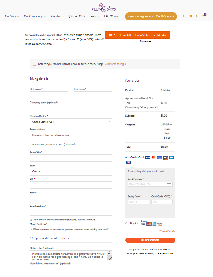
As you can see, this page asks for minimal information. There are no visual distractions, and the process is short enough that it fits on one page.
2. Make Sure Your Checkout is Mobile-Friendly
With more and more customers making purchases on their mobile phones, it’s important to ensure that you have a mobile-friendly checkout.
For instance, you may want to enable payments with digital wallets such as Google Pay and Apple Pay:
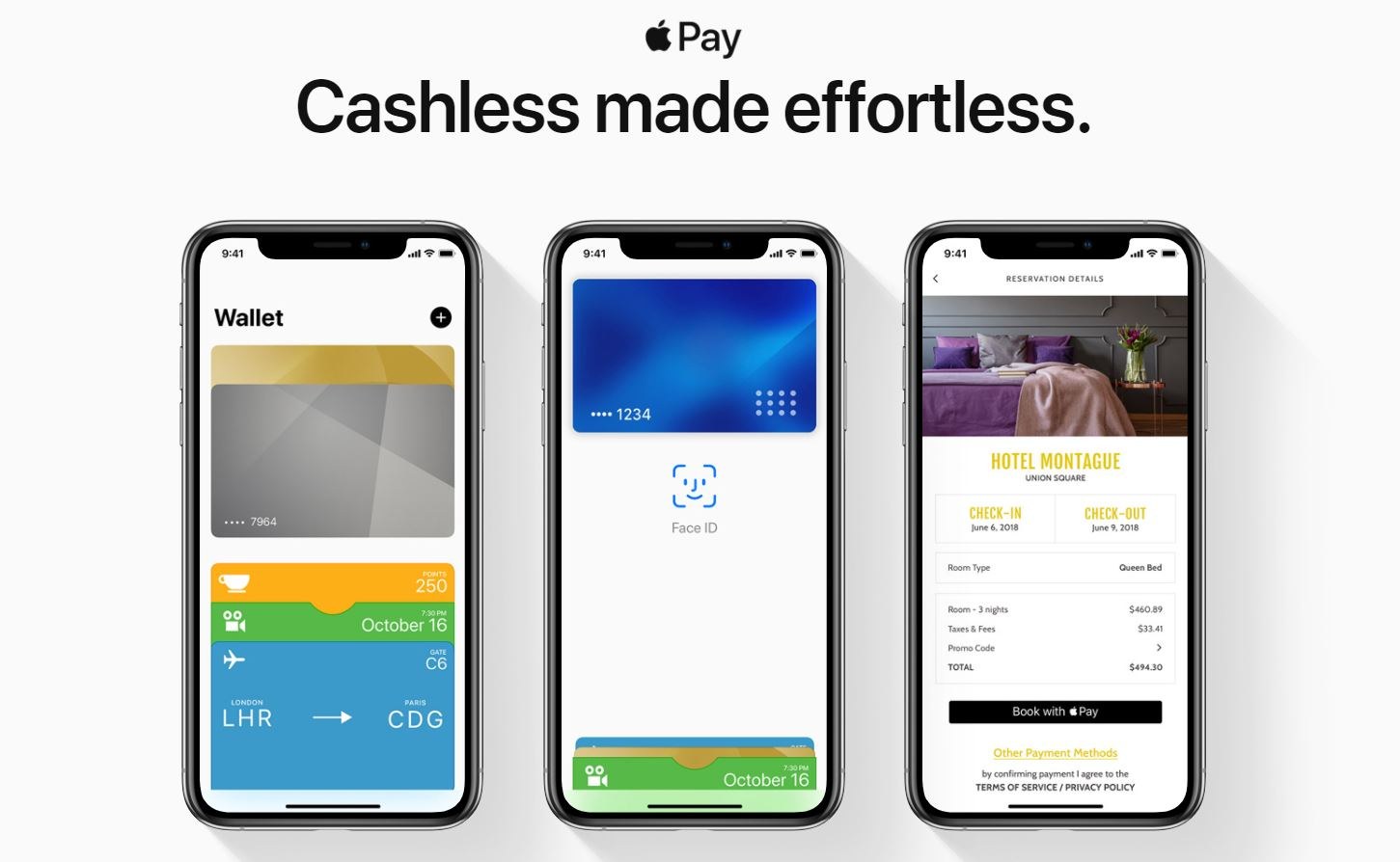
This way customers can use their stored payment details to complete their orders more quickly.
You can also use a buy now button to give customers the option of skipping straight to the checkout page. Especially on mobile devices, people appreciate a fast and easy purchasing process without the extra loading time.
At Buy Now Plus, we help you create high-converting buttons for a quick and easy checkout on any device.
Moreover, you'll be able to use these buttons on other platforms, including your social media pages and newsletters. This means you can accept payments from anywhere online.
3. Eliminate Surprises
A general rule of thumb for user experience (UX) is this: the more predictable your design and flow are, the better. Jarring, surprising experiences are an easy way to drive visitors away.
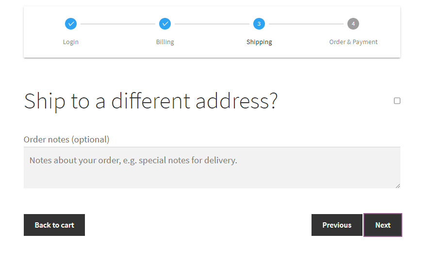
Therefore, it's a good idea to guide your users through the checkout process. You can use a multi-step checkout, which is excellent for reducing the amount of scrolling buyers have to do.
This enables you to cleanly display everything on a single page using a multi-step form:
There’s another surprise no one likes to see: high shipping costs. Depending on the platform you’re using, it may not be possible to give an exact shipping amount early on.
However, you might want to provide an estimate or make it clear that there will be shipping and handling fees.
If you’re looking to speed up your checkout process a little more, you could offer a guest checkout option. Many customers, especially one-time buyers, don’t want to deal with setting up another account.
4. Keep the Checkout Design Consistent With Your Site
Having a professionally designed site can help you build trust. On the other hand, messy and inconsistent design might make your site look suspicious, scaring customers away.
Your checkout style should be consistent with your site. This means it should avoid any jarring, unnatural transitions.
You never want to make customers feel like they’re being shipped off to someone else to make their payments, unsure if they’re paying you or a third party.
With Buy Now Plus, you can fully customize your buy now buttons so they match your branding. This way, you can keep a cohesive design throughout your checkout process.
5. Include Obvious Security Features
Finally, your checkout process should also show users they can trust you with their payment details. Therefore, you may want to provide secure payment options such as PayPal and Stripe:
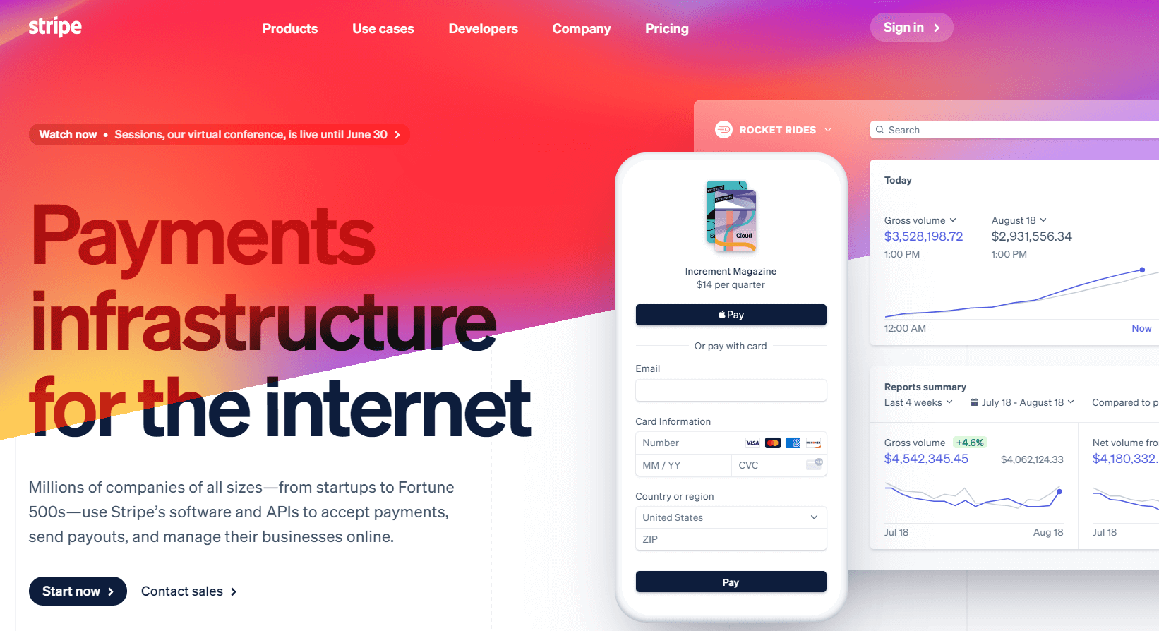
Displaying the names and logos of your payment providers can be a great way to offer that additional sense of security. Additionally, you'll want to ensure that these options are placed in a prominent area on your site, so customers are able to see them right away.
You'll be pleased to learn that Buy Now Plus runs on Stripe. This means that, as an online seller, you and your customers will benefit from Stripe's fraud protection and other security features.
Conclusion
A simple checkout experience can mean the difference between customers leaving your site with the products they love, or walking away empty-handed and frustrated.
Fortunately, you don't need to put a lot of effort (or money) into optimizing your customer journey.
In this post, we looked at five effective ways to improve your online checkout experience:
- Simplify your checkout page by only asking for information that you need and minimizing visual distractions.
- Make sure your checkout process is mobile-friendly and cuts out extra steps, by using a service like Buy Now Plus.
- Get rid of surprises like high shipping costs, and let buyers know exactly where they are in the checkout process.
- Keep your checkout design consistent with your brand.
- Include secure payment methods, such as PayPal and Stripe, so your buyers feel safe when they’re checking out.
Do you have any questions about how you can implement these tips to improve your customers’ online checkout experience? Let us know in the comments section below!
If you liked this post, be sure to follow us on Twitter, Facebook, and LinkedIn.