A sales page operates as a one-page ad for your product or service. When someone visits this part of your website, they’re already thinking about buying from you – they just need a little push.
Your sales page must emphasize the benefits of your product, answer any misgivings the potential customer might have, and (above all) make it easier for them to commit. Fortunately, this isn’t hard to achieve with a few proven techniques.
In this post, we’ll go through five critical tips for building the perfect sales page. You’ll learn how to create a sales page, how to improve it, and how to get people to take the next step. Let’s get started!
Why It’s Vital to Fine-Tune Your Sales Page
Think about the last time you visited a sales page. It may have been for a piece of software, new technology, clothing, or even furniture. Did you decide to buy the product? Why or why not?
A sales page is important because it is the very end of a sales funnel. All of your marketing efforts are often focused on bringing leads to this key page. Once there, you’ll need to encourage them to take that final step and make a purchase.
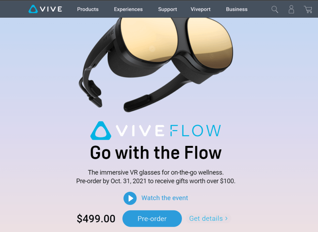
While a sales page may often look simple, there’s an art to building one that’s effective. The sales page for the HTC Vive (pictured above) doesn’t just describe the product. It also creates a value proposition (“gifts worth over $100”), makes it easier to buy (“Pre-order”), and addresses potential misgivings (“Get details”).
How to Create a Perfect Sales Page (5 Key Tips)
When optimizing your sales page, it might help to think about it like an ad you’d see in a magazine. It has to be compelling enough to encourage people to read it, and it needs to give them all the information they require to make an educated decision.
Let’s take a look at some tips for doing just that!
1. Punch Up Your Headlines
On the web, most people scan each page in an “F” shape. They read headlines, loosely scan the body, and then look at the conclusion. This behavior has many ramifications, including that it’s a mistake to write your headlines solely for search engine optimization purposes.
Instead, headlines should be written first and foremost for human visitors. They need to be simple, interesting, provocative, and useful. Your goal is to deliver immediate value to the customer, describing what they stand to gain from purchasing the product or service on offer.
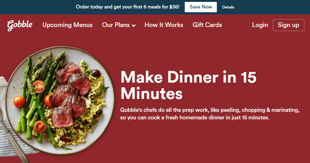
For example, this sales page has an obvious value proposition – you can make dinner faster:
You can use tools such as CoSchedule’s Headline Analyzer to improve your headlines, making them more evocative, emotional, and transparent.
2. Deliver a Clear Call To Action
A call to action (CTA) tells a customer what to do next. On a given landing page, your primary CTA could be:
- “Call us for more information!”
- “Start a live chat!”
- “Sign up for our email newsletter!”
- “Buy Now!”
A CTA increases conversion rates because it lets the customer know what the “next step” is. Any time a customer is uncertain, you risk losing the sale. They may get distracted, or they might just not know where to go or what to do.
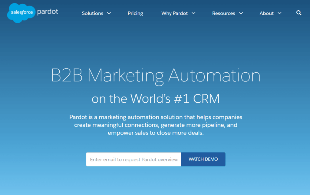
If you look at the following landing page, you’ll see that the CTA (“Watch Demo”) is as straightforward and visible as possible:
On a sales page, your CTA is generally a “buy now” button. This element provides a simple, clear, and effective way to increase conversions.
3. When Possible, Personalize
80% of customers prefer websites that deliver personalized experiences – those that are tailored to each customer. By creating an experience that is more likely to be relevant, you can increase sales.
Some companies personalize their sales pages by tailoring them to each customer’s location. Other websites use tracking cookies to detect the user’s prior behavior (such as products they liked) so they can promote relevant items. The more information you have about a user, the more customized your page can be.
A personalized experience can be as simple as geographically targeting the user’s location, or as complex as tracking their prior purchases. If a user is already logged in to an account, they can also be addressed directly (“Welcome back Kim!”) to make your website feel less impersonal.
4. Add Reviews and Testimonials
Why should a customer trust you? They may have never heard of you or your product before. Fortunately, reviews and testimonials can build trust with a company in a way that other marketing techniques often cannot. When readers relate to a reviewer and their problems, it primes them to see your business as a solution.
For example, this slideshow of testimonials highlights how the product can improve a company’s operations:
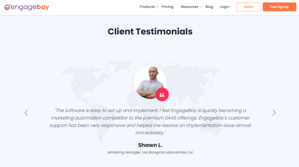
Rather than just describing how their product can help, this business lets you see the perspective of their existing (happy) customers.
Therefore, it’s smart to consider adding some of your company’s best testimonials to your sales page. As potential customers dig further into information about your product, they’ll see that it has helped customers just like them.
5. Make Sure Your Page Works on Mobile Devices
Mobile sales make up about 73% of all sales today. Still, many companies build their websites on desktop computers or laptops. It’s easy to forget that a sales page doesn’t just need to function on a mobile device – it has to look just as good on small screens as on large ones.
One way to do this is to be deliberate about your “above the fold” content. This is the text, images, and other elements that appear immediately on a user’s screen before they scroll down the page. This content should make your primary value proposition clear, and should be short and simple so it’s immediately viewable to visitors on mobile devices.
It’s also important to test your landing page on all the platforms you can, including on mobile devices. A “responsive” or “mobile-friendly” design will tailor itself automatically to whatever platform is being used, rather than requiring multiple versions of the website for each platform.
Conclusion
Your sales page is an incredibly important stop on the buyer’s journey. It’s the best place to increase conversions, so you need to make sure it’s well designed, clear, and compelling.
You can improve your sales page by following these tips:
- Make your value proposition clear through better headlines.
- Deliver a clear CTA to encourage the customer to buy.
- Personalize your page to increase relevance and engagement.
- Add testimonials to build trust and legitimacy.
- Ensure that your page works properly across all platforms.
As a customer, what makes you stop at a sales page? What does it take to get you to convert? Comment below and tell us about your favorite tricks of the trade!
If you liked this post, be sure to follow us on Twitter, Facebook, Pinterest, and LinkedIn.